Borders Biscuits | Ad Campaign Artworking


Borders Biscuits | Haygarth
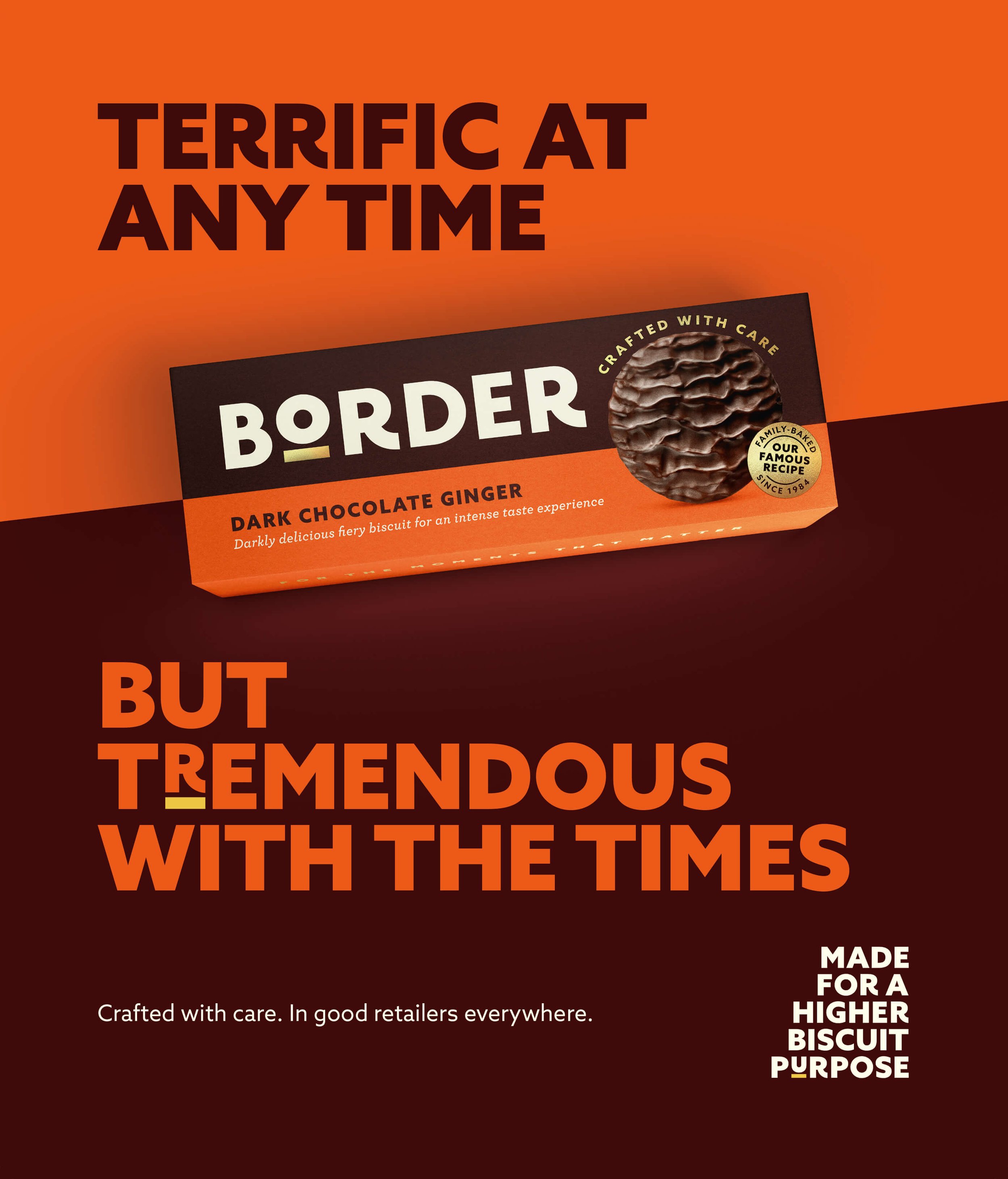
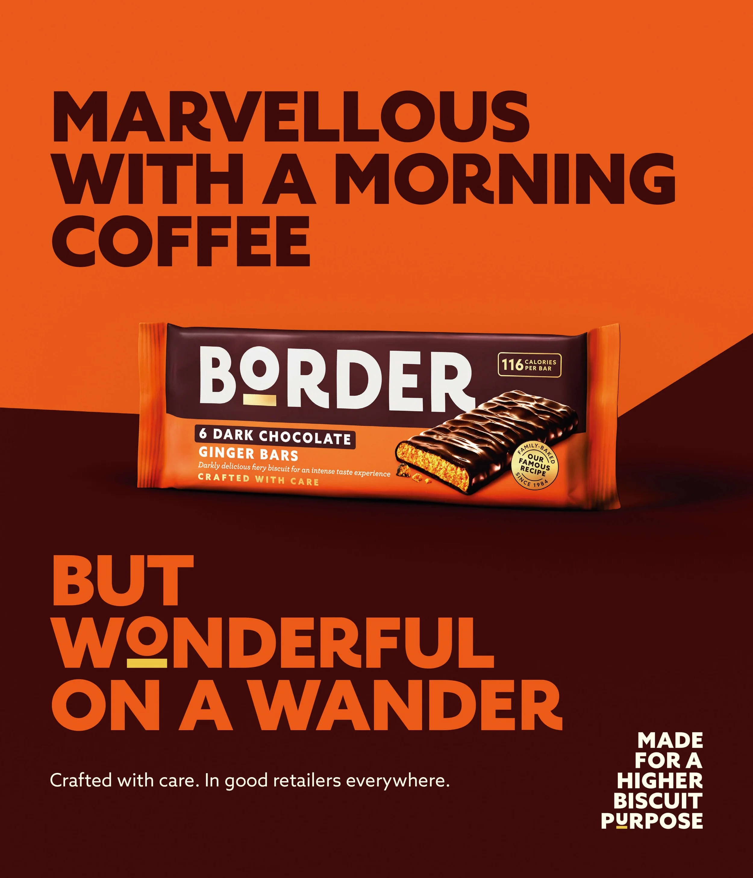
This bold and flavour-packed campaign for Border Biscuits celebrates the perfect pairing of a premium biscuit with life’s little moments — whether it’s with a cuppa, a good read, or a long weekend. My role focused on the artwork production and retouching, ensuring every visual delivered on both creativity and clarity while adhering tightly to brand standards.
Consistency was key. Working from agency-supplied creative and brand guidelines, I paid close attention to everything from colour accuracy to shadow balance — fine-tuning each visual element to maintain a uniform look and feel across a wide suite of assets. This included managing typography layouts to ensure alignment with campaign tone, and applying a careful approach to colour profiles for both digital and print outputs. Every variation had to hit the right notes for contrast, vibrancy, and legibility, while ensuring product imagery popped with clarity.
Product photography was extensively retouched to highlight texture, sheen, and depth — bringing a mouthwatering, high-resolution finish to every biscuit shot. This ensured the visuals translated beautifully whether scaled up for large-format outdoor displays or optimised for social feeds and in-store promotions. I worked closely with Haygarth’s team to prepare artwork for various media specs, adapting layouts and technical requirements for retailers and media partners, each with their own quirks and publishing constraints.
From the bold blocks of colour to the strong typographic tone of voice, this campaign is a great example of balancing playful messaging with premium production. It’s not just about making things look good — it’s about making them look consistently brilliant wherever they appear.